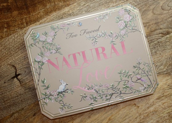
Too Faced “Natural Love” Palette

Alright, so I have been wanting to review this bad boy for a little while now and after a few weeks of use, I now feel prepared to share some thoughts. So…here we go:)
Too Faced released their Natural Love collection on March 9th, 2017 which included, three prismatic highlighters, a 30-pan eyeshadow palette, a line of cocoa-infused eyebrow pencils, and they added 6 new shades to their existing “Melted” liquid lip line-up. The full collection is available for purchase on the Too Faced website, Ulta.com, and on HSN. Everything except the eyebrow pencils are available on Sephora.com. I purchased my eyeshadow palette and two of the highlighters from Too Faced website on the release date.
The Basics:
Purchase Price: Natural Love Eyeshadow Collection $59 USD + free shipping (free on any order over $50 USD)
*Note for shipping – For U.S. and Canada, this product is available on the Too Faced, Ulta, and Sephora websites. HSN ships to the U.S., including U.S. territories. International customers will have to order on Sephora.com and/or check out the international shipping list provided on TooFaced.com. Shipping rates will vary.
Cart to door time: 20 days (!!!!!) (Ordered 03/09/2017 > Received 03/28/2017)
I have been using this product daily for about three weeks.
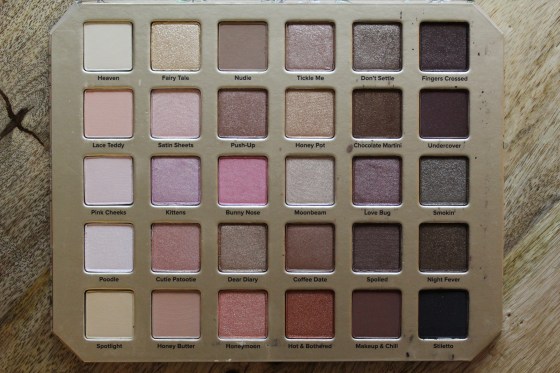
Natural Love Eyeshadow Collection:

Mine arrived a little battered:)
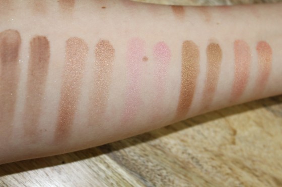
Swatches:
Now, normally when I review a product I have little spiel about no primers, sprays, etc. because I want to show the strength of pigmentation; however, some of these shadows did not show up (at all) on bare, dry skin. So, with that in mind, I decided to do things a little differently. I am going from column to column. The top photo is how I typically do things:
“All swatches are done on clean, bare skin. No primer or sprays are used. I do two swatches side-by-side with each color. The left swipe is done using my finger, while the right swipe is done with a flat, synthetic eyeshadow brush. I only do one pass because I think it shows the strength of pigmentation.”
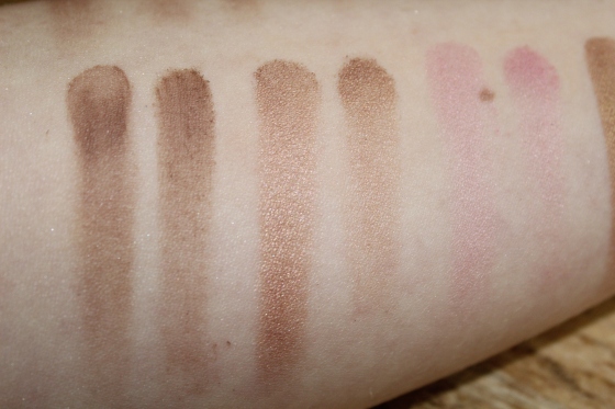
The second photo is the same column, swatched in the same manner, over Too Faced Shadow Insurance Primer.
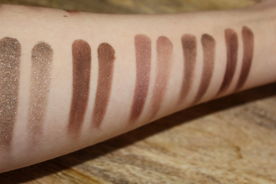
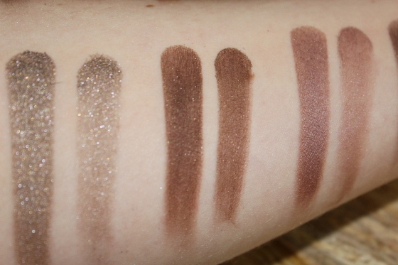
Column One:

Left to right (no primer): Heaven, Lace Teddy, Pink Cheeks, Poodle, Spotlight

Left to right (primer…I swear it’s there): Heaven, Lace Teddy, Pinks Cheeks, Poodle, Spotlight
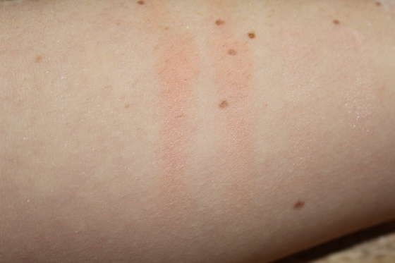
Left to right (close-up with primer): Heaven (no that’s not bare skin), Lace Teddy, Pink Cheeks
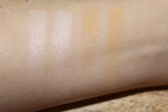
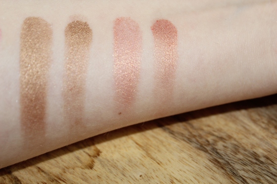
Left to right (close-up with primer): Poodle, Spotlight
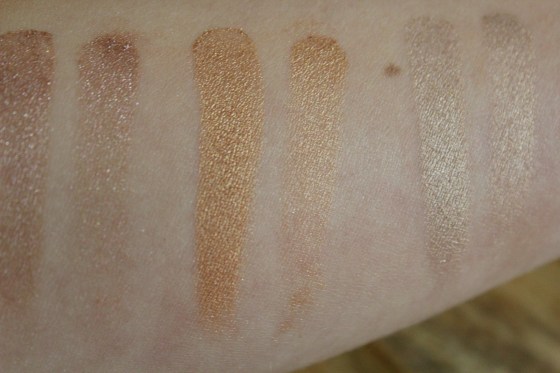
Column Two:
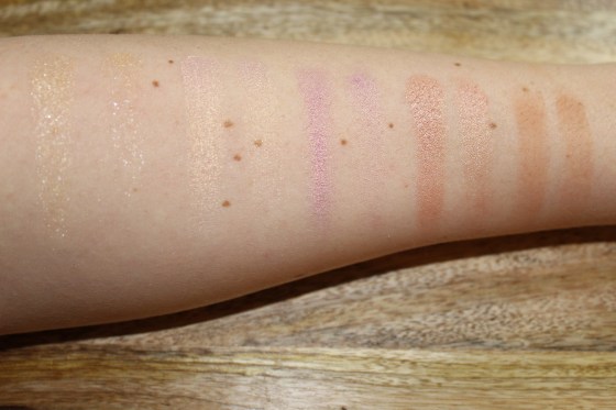
Left to right (no primer): Fairy Tale, Satin Sheets, Kittens, Cutie Patootie, Honey Butter

Left to right (primer): Fairy Tale, Satin Sheets, Kittens, Cutie Patootie, Honey Butter
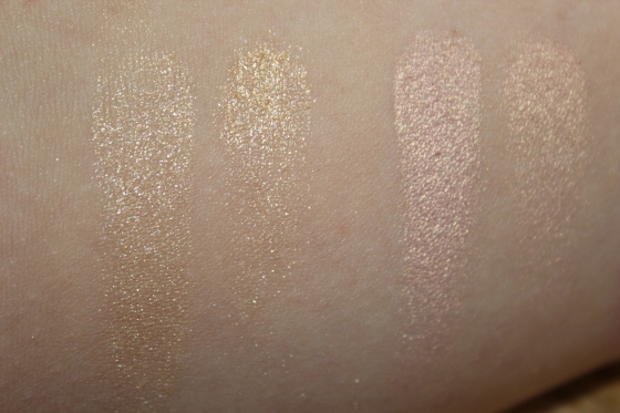
Left to right (close-up with primer): Fairy Tale, Satin Sheets
Left to right (close-up with primer): Kittens, Cutie Patootie, Honey Butter
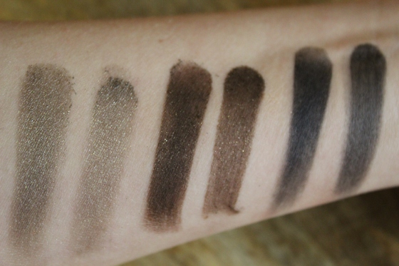
Column Three:
Left to right (no primer): Nudie, Push-Up, Bunny Nose, Dear Diary, Honeymoon
Left to right (primer): Nudie, Push-Up, Bunny Nose, Dear Diary, Honeymoon
Left to right (close-up with primer): Nudie, Push-Up, Bunny Nose
Left to right (close-up with primer): Dear Diary, Honeymoon
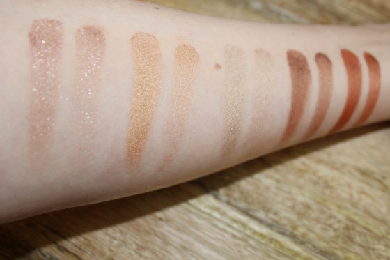
Column Four:
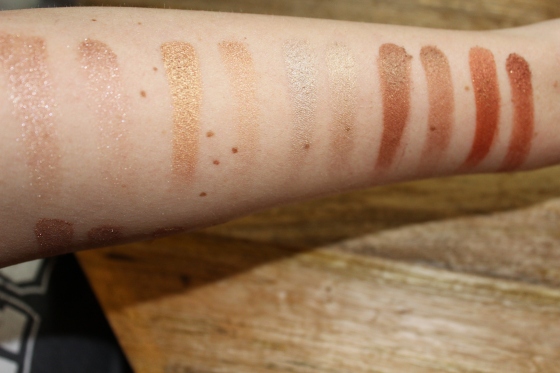
Left to right (no primer): Tickle Me, Honey Pot, Moonbeam, Coffee Date, Hot & Bothered
Left to right (primer): Tickle Me, Honey Pot, Moonbeam, Coffee Date, Hot & Bothered (sorry for the blurriness on this one!)
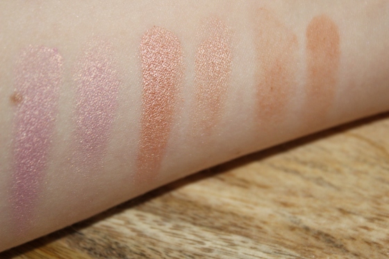
Left to right (close-up with primer): Tickle Me, Honey Pot, Moonbeam

Left to right (close-up with primer): Coffee Date, Hot & Bothered
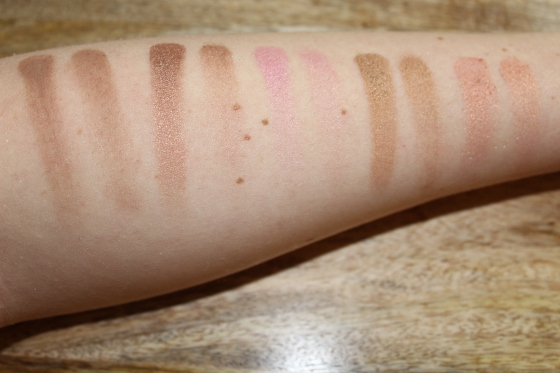
Column Five:
Left to right (no primer): Don’t Settle, Chocolate Martini, Love Bug, Spoiled, Makeup & Chill
Left to right (primer): Don’t Settle, Chocolate Martini, Love Bug, Spoiled, Makeup & Chill
Left to right (close-up with primer): Don’t Settle, Chocolate Martini, Love Bug

Left to right (close-up with primer): Spoiled, Makeup & Chill
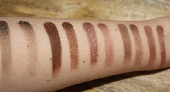
Column Six:
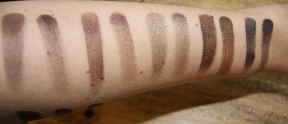
Left to right (no primer): Fingers Crossed, Undercover, Smokin’, Night Fever, Stiletto

Left to right (primer): Fingers Crossed, Undercover, Smokin’, Night Fever, Stiletto
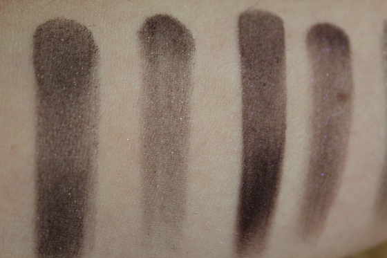
Left to right (close-up with primer): Fingers Crossed, Undercover
Left to right (close-up with primer): Smokin’, Night Fever, Stiletto
Shade Breakdown:
Heaven ~ This is a matte, cream shade that would be a great addition if the quality were better. It feels chalky and blends away easily. I’ve been using this to set my eyeshadow primer because it has no color payoff. For that it works great!
Lace Teddy ~ A matte, light pink shade that has the same texture as Heaven, although it does leave color on the skin. I’ve been using it to blend out my crease with some success; however, it disappears VERY quickly. Within a few hours I wouldn’t know I ever had it on.
Pink Cheeks ~ A light pink shade with silver shimmer. The shimmer is very finely milled; however, the shadow itself is powdery and chalky. I feel that it’s similar in quality to the previous two shades.
Poodle ~ This is a pearlescent shadow that pulls more pink in tone. It also has a finely milled, silver shimmer. Poodle is honestly one of the best shades when considering the lighter range of colors in the palette. It has a creamy texture overall with good pigmentation and blendability.
Spotlight ~ This is described as a “butter cream” and I would have to agree. It has a yellow tone and a matte finish. Again, I found this to be chalky with little staying power. The color does show up a bit more than other lighter shades in the palette.
Fairy Tale ~ This is a VERY shimmery golden shade with gold reflects. When applied to the skin it looks more like a gold glitter because the pigment doesn’t really seem to adhere to the skin. It’s pretty apparent in the swatches and primers don’t seem to make much of a difference. I’ve been using it as a topper to other shadows with some success.
Satin Sheets ~ Finally, a shade that I enjoy:) Satin Sheets is honestly beautiful and well done. It has a pink base with golden shimmer (not glitter!). I find that it has a creamy texture and good staying power.
Kittens ~ We’re on a roll:) This is another good one — similar in formula to Satin Sheets. It is a nice lavender with golden shimmer. Absolutely love this shade.
Cutie Patootie ~ Also, really good! Nice creamy texture and applies smoothly. It is a champagne shimmer. No complaints–it’s beautiful.
Honey Butter ~ This is another chalky/powdery/disappointing shadow which seems to be the norm for mattes in the palette. A caramel color that doesn’t have particularly good staying power. Pretty sub-par all around.
Nudie ~ A good matte:) Nudie is a tan shadow with great pigmentation. I love the texture — super creamy. Overall, it’s pretty good.
Push-up ~ This is one of my favorites in the entire palette. It’s a shimmery bronze that I have been using continuously. No complaints.
Bunny Nose ~ Described as a “cotton candy pink” with silver shimmer. This was one of the shades that initially caught my eye; however, the quality is disappointing. Color payoff is okay, but it is really powdery. When you try working with it the pink dusts off, leaving more of a silver shimmer on the skin.
Dear Diary ~ This is pretty close in tone to Push-up but it leans more gold. I don’t really have any issues with it. The quality is good — not great, not bad either.
Honeymoon ~ This is more of a muted coral with gold shimmer. It’s actually really nice — builds and blend well. Not too shabby.
Tickle Me ~ This is a similar shade to Push-Up, although it doesn’t have the same color payoff. You get more shimmer than color.
Honey Pot ~ Gold, gold, and more gold. There is no other way to describe this. It’s so good — all the way around.
Moonbeam ~ I didn’t know how to describe this so I pulled the description from Sephora — “white gold metallic”. This is a great center of the lid color, inner corner highlight…it can be used a number of ways and has a nice, creamy formula.
Coffee Date ~ This is more of a brown copper. It has a drier texture, but not as dry as some of the light shades. I think it has decent color payoff and builds well.
Hot & Bothered ~ Straight-up copper. It has a gritty feel to it as first, but it’s surprisingly nice. Excellent pigmentation and decent wear-time.
Don’t Settle ~ This is a brown shimmer with silver reflects. Nice pigmentation with a creamy texture.
Chocolate Martini ~ This shade is pretty bad. It is dry and hard to work with. It’s described as a “gilded deep espresso”. Basically it is a dark brown with a lot of gold glitter that gets everywhere. Not good.
Love Bug ~ A nice deep plum color with silver shimmer. Creamy, nice pigmentation — I’ve been using this a lot.
Spoiled ~ This is a chocolate shimmer with similar texture to Love Bug. Another good shade.
Makeup & Chill ~ This is a dark, brown. As with almost all of the other mattes, this is not that great. It feels like chalk and is difficult to work with.
Fingers Crossed ~ Another dark brown with gold shimmer. Super dry and again, difficult to blend out. It becomes a muddy mess on the eyes when blending and has a great deal of fallout.
Undercover ~ A dark plum with a brighter purple shimmer…If I made a table with categories, this would go right under “dry, chalky, hard to blend”.
Smokin’ ~ This is described as a taupe, but almost has an olive undertone. It is another shimmery shade, but has a creamy texture and builds well. Overall, I like this one.
Night Fever ~ Again — “dry, chalky, hard to blend” category. Described as a “black khaki with gold shimmer”.
Stiletto ~ Nope. Not good. This ends up coming off as a grey because it lacks pigmentation and the texture is really, really dry. I know I have better quality matte black shades that I’ve purchased at the drugstore.
The Nitty Gritty: Okay, so if it wasn’t apparent in the shade breakdown, I have very mixed feelings about this palette. I think that some of the shades are really good, but the bad ones are REALLY bad. When I look at the palette as a whole there are MAYBE about 15 shades that I will continue to reach for and that’s a pretty big maybe. For $59 I just don’t think that it’s worth it. There are really only a few quality shades that are unique in color but you can find the majority elsewhere, for less money. What I find frustrating is that there is almost an entire column with little to no color payoff using their own eyeshadow primer. Unfortunately, I feel like this is pretty consistent for Too Faced products that have been put out over the last couple of years so I can’t say I’m surprised. With that being said — if I had to do it over, I’d probably pass on this one.
On a personal note, I have been a long-time fan and supporter of this brand. I have had MANY a long night waiting up for their early morning product launches because I felt like I was supporting such an amazing company and I believed in the quality. Unfortunately, over the last few years I have been consistently disappointed not only in their products, but their customer service as well. Shipping times seem to get stretch out to the absurd and it’s VERY difficult to get a hold of someone when something goes wrong. In the five times I have contacted them about an order, I have only received one response and that was through email nearly two weeks after I sent one to them. In terms of product quality, it’s just not something that I can count on anymore. I know every brand has some issues with this, but Too Faced is consistently inconsistent. I feel like there has been more put into the social media campaigns and packaging than the actual product. So with that, I will be reviewing the other products from my order (Too Faced Love Light Prismatic Highlighters), but I won’t be purchasing any more from the company unless I see some kind of change. Not trying to take a stand or anything — just sharing my full experience.
BUT just because I’m not, doesn’t mean you’re not soooo…I did receive a coupon code with my order. If you would like to use it please feel free. It is a one-time use code so once someone applies it to their order it will become inactive. It is 20% off of a purchase on TooFaced.com and is valid until April 29th.
Code: 372P3L2FACEJE
Just a note: I do not receive any benefit from the code whatsoever. It’s yours to use as you like. Thanks for reading and happy shopping!!
~ XOXO


Bummer that some of these shades aren’t that pigmented! I’ve been feeling kind of iffy with their products lately like their white chocolate chip palette. Great post btw! 🙂
I know, they come out with such great concepts too — just not the best follow through. I’m totally with you on the WCC palette too! It has been sitting in drawer since I bought it–not good at all. Hopefully things turn around in the future:) Thanks for reading!! ❤
I wish they were better pigmented! Such a downer! I swear some drug store dupes are better! I just did a post a few minutes ago on my dupes I tried from Pinterest! I swear the drugstore held up or did better than expensive makeup!
Anyways great blog post and I followed!!
Love this!
Follow me please! Anyone’s welcome!
I know me too! I definitely have drugstore dupes that perform way better — Milani, NYX…so much less expensive. I’m excited to read your post. Thanks for the feedback and follow! ❤
Pingback: Too Faced “Love Light” Prismatic Highlighter Review/Swatches | clumsy in heels
I love “Honey Pot” it’s in the original Natural Eyes 9 shadow palette and it’s one of my favorite shades ever! The gold is absolutely perfect!
Me too! It is REALLY good — I reach for it all the time. I ended up skipping on a lot of the 9-pans but I’ve heard that ‘Natural Eyes’ is pretty amazing 🙂